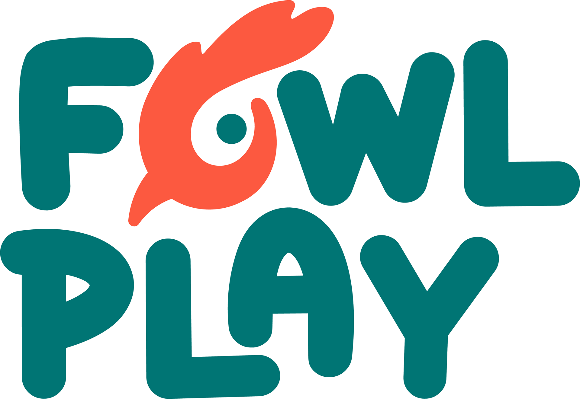
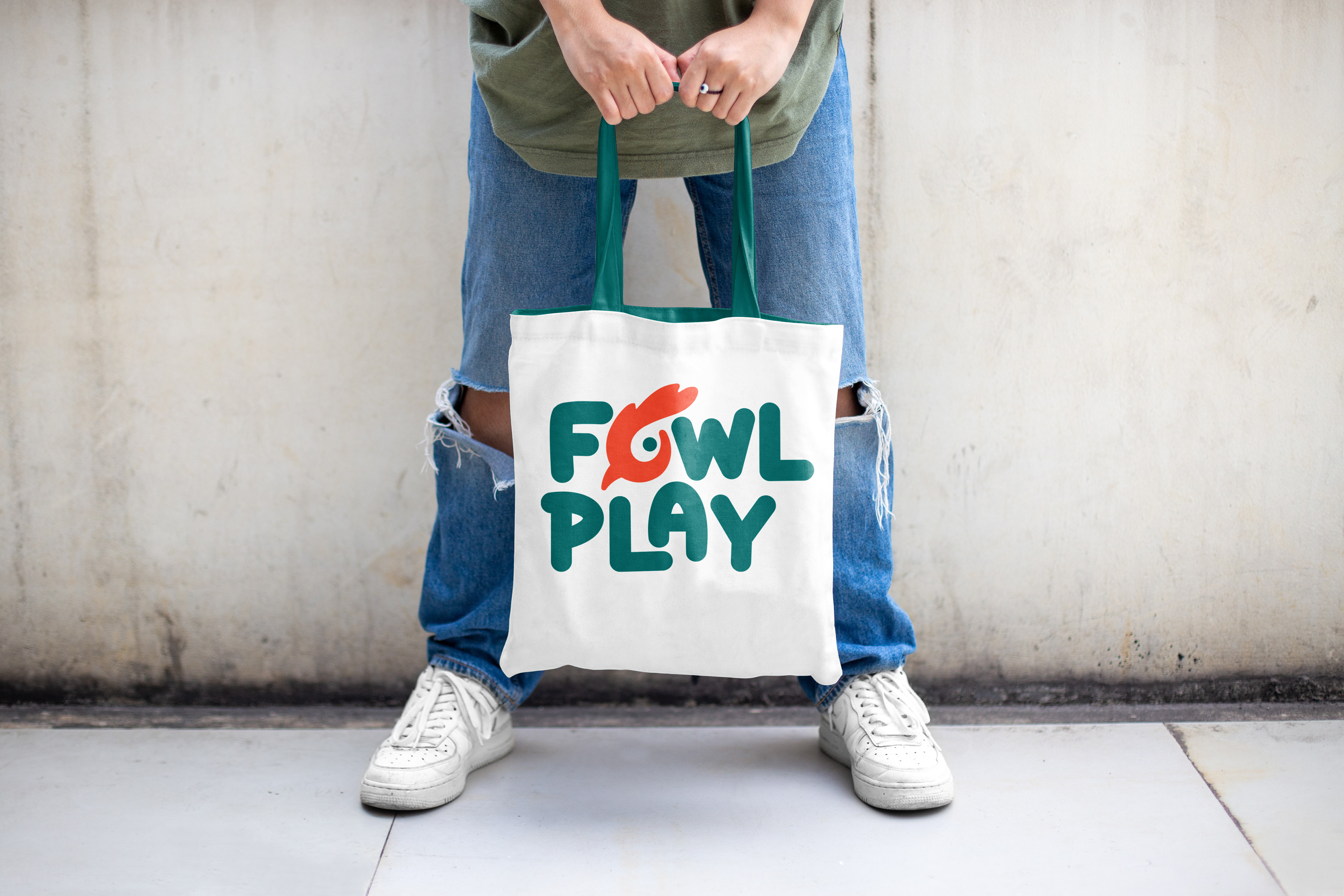
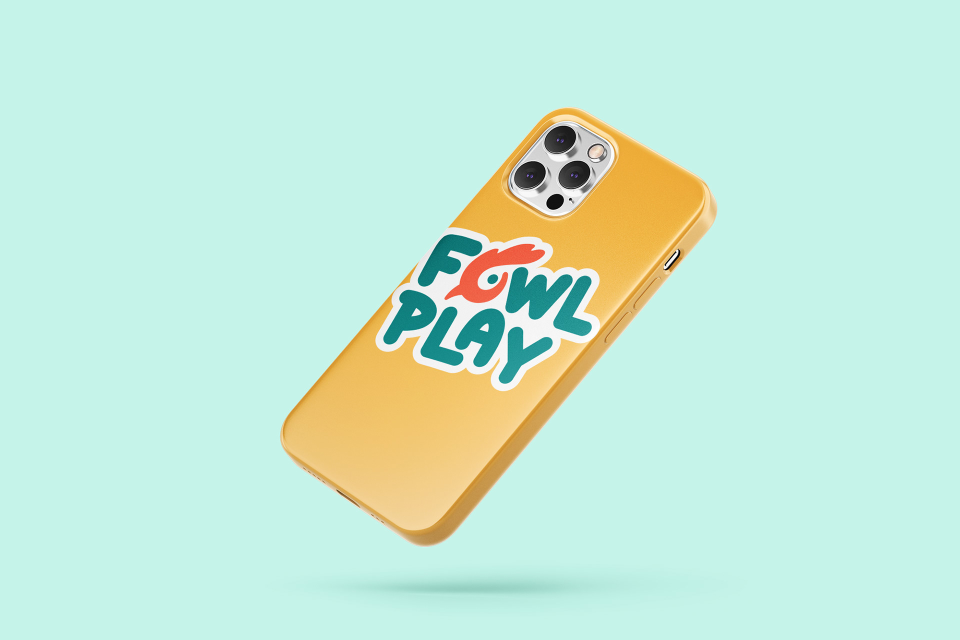
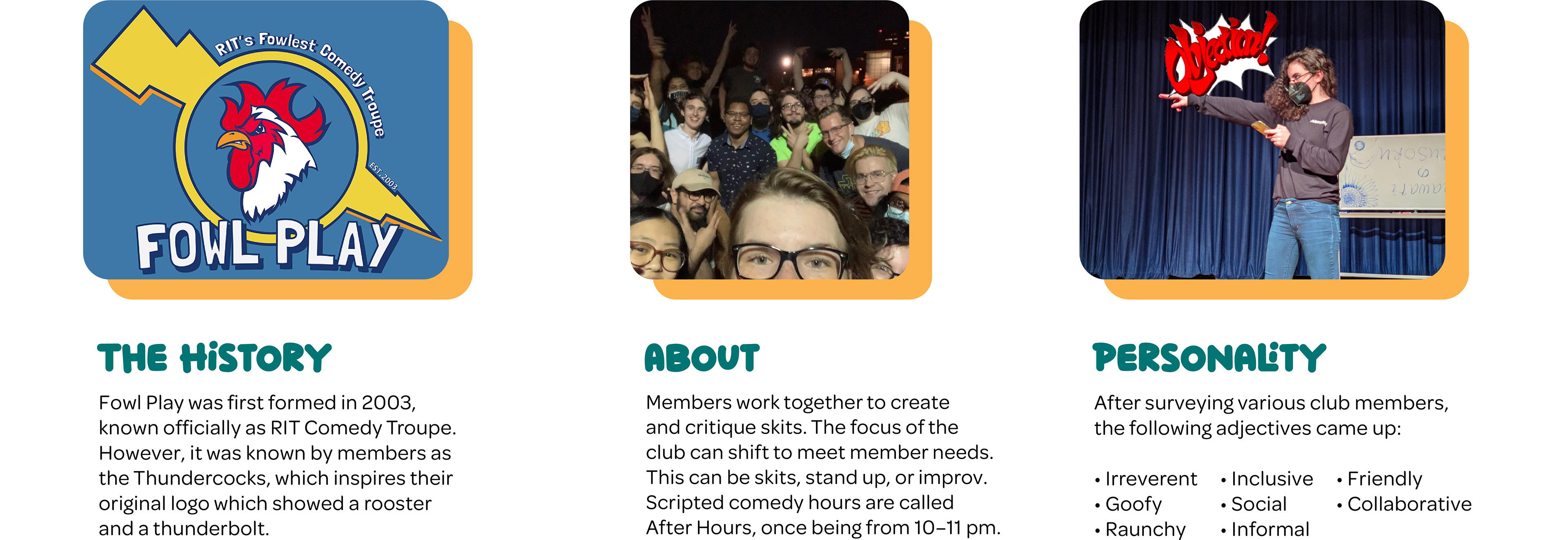
The Objective
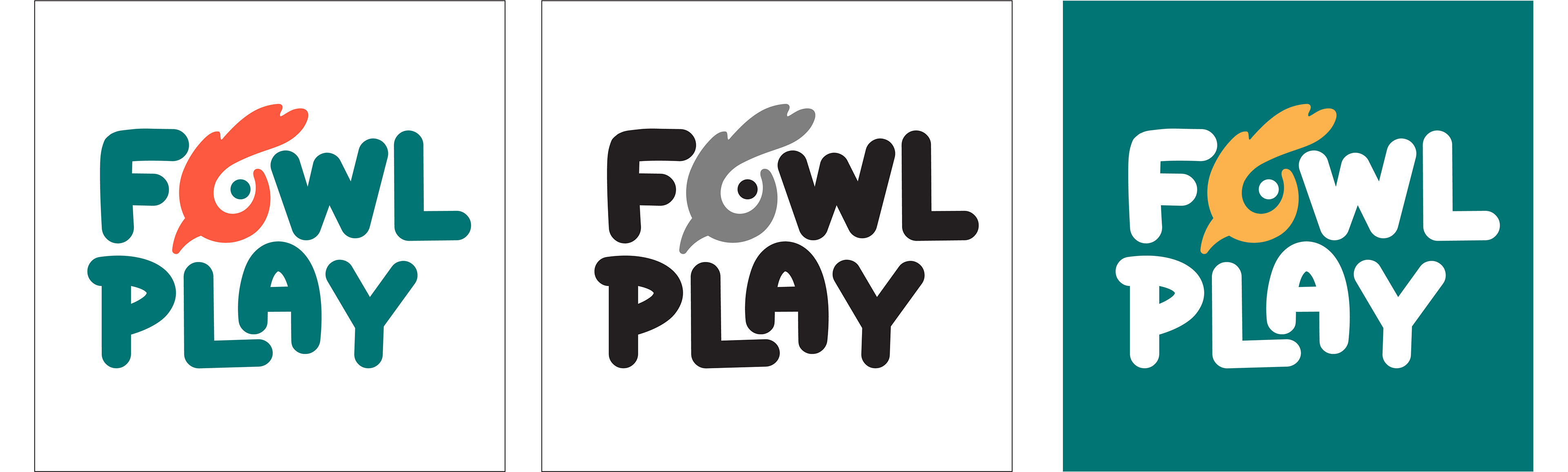
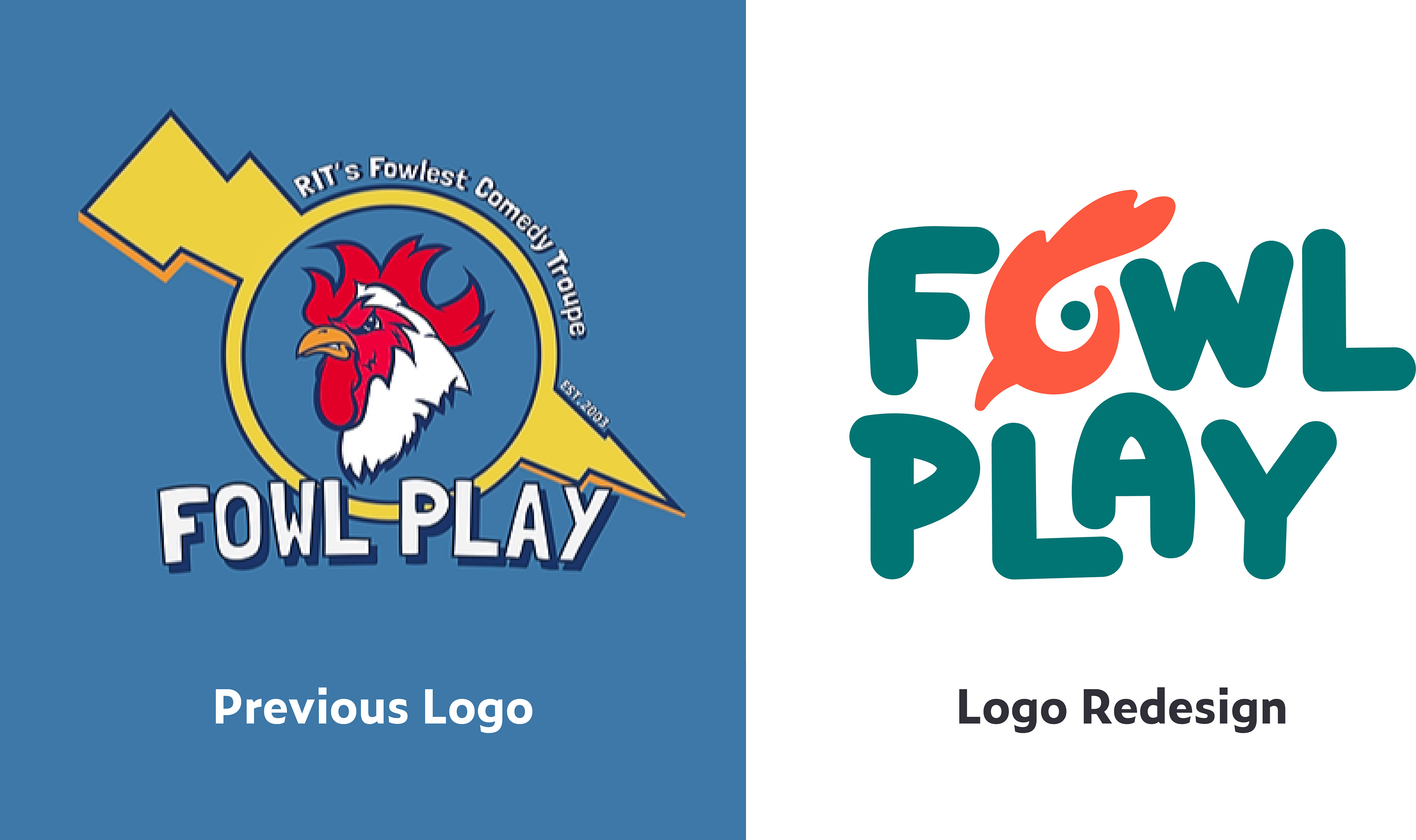
Here, I was challenged to redesign a logo for the student organization Fowl Play. The group is a comedy troupe at Rochester Institute of Technology that puts together workshops and performances of improv and sketch comedy. My challenge would be redesigning a logo that stayed true to the group's quirky persona while creating a modern logo that could be easily used in multiple applications. One aspect I felt strongly about was incorporating their mascot of a chicken, which is central to their pun name, their history, and their identity. My logo went through many iterations of the chicken character and typeface, but I ended on a solution that I felt truly captured the fun spirit of the group with every detail. The logo was well received, and it was even given a spotlight on the RIT Graphic Design program website.
Research
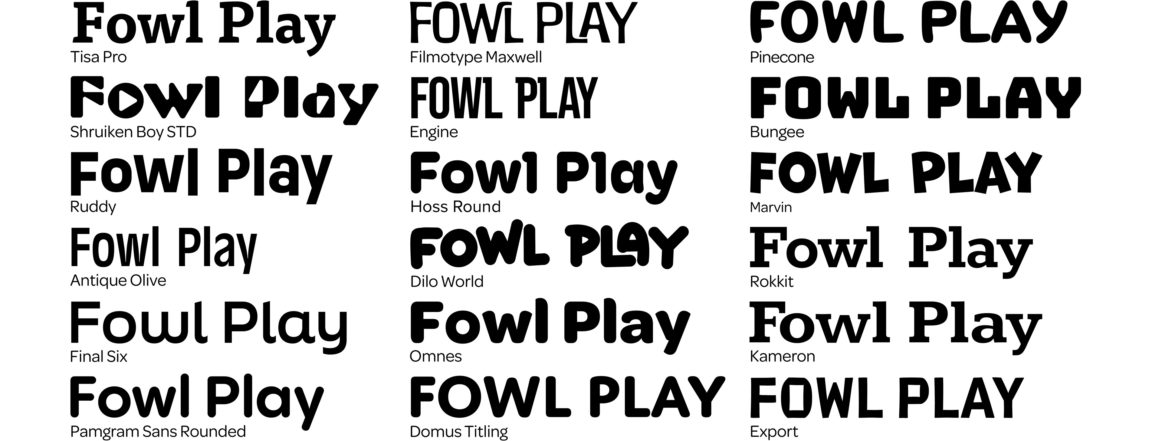
Typography Studies
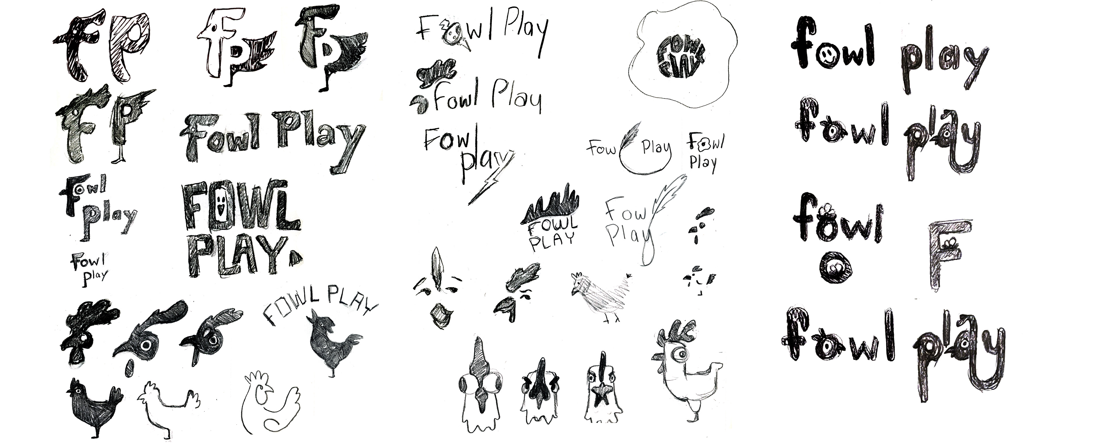
Sketches
First Round Iterations
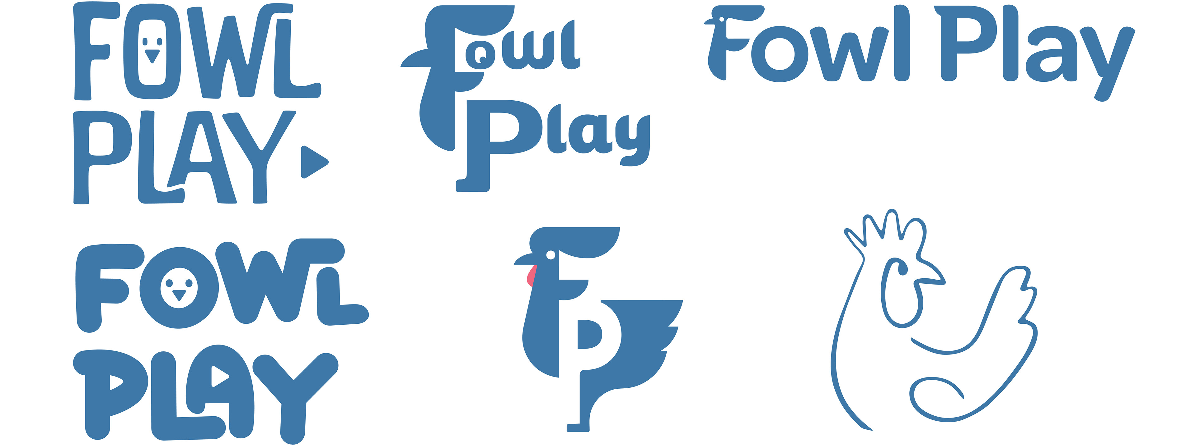
First Round Feedback
When I first started the project, I fell in love with the idea of a lettermark made up of a chicken. The comb of the rooster formed the F and the P was formed in the negative space of the wing and the foot. Upon testing, I learned that this idea didn't read, and people did not pick up on the F and the P in the logo. This meant I would have to kill my darling, but I'm grateful this led me to my next, more successful directions.
Second Round Iterations
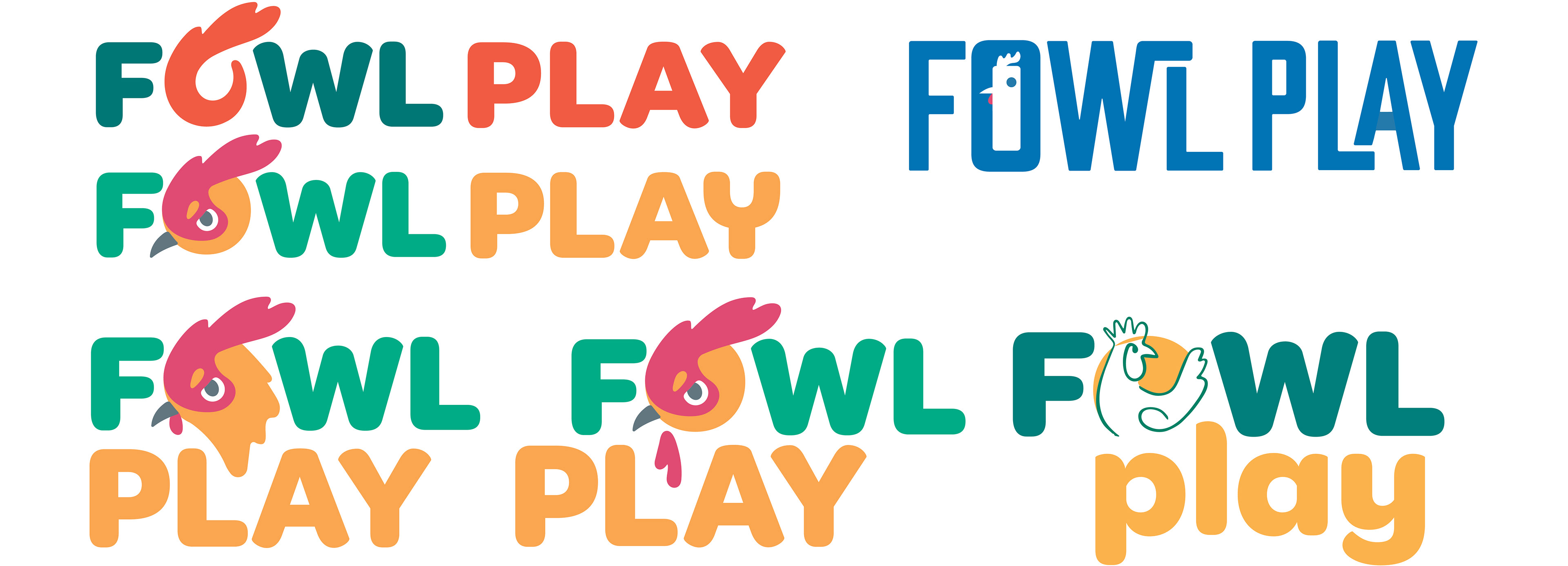
Second Round Feedback
After the second round of iteration I received helpful feedback. One suggestion I got that changed my thinking on this logo was that the goofy Fowl Play spirit of this logo shouldn't just rely on color, it should show through in the organization of the text itself. This feedback was a real breakthrough, and I was able to use it to create a logo I loved. The final logo contained many of the seeds of my original sketches, woven together in a fun new way. The journey of start to finish on this logo was both exciting and difficult as I worked to capture everything Fowl Play represents.
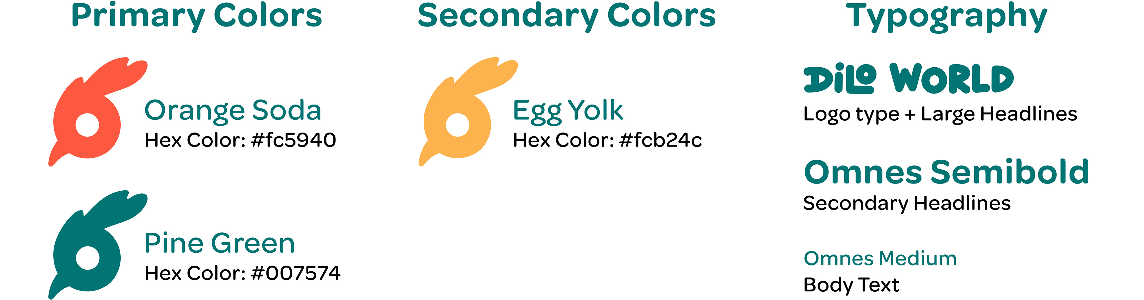
Another issue I found during this round was that the egg-yolk orange was too close to yellow, and yellow logos are difficult for legibility. I originally included the yellow because Fowl Play's prior logo used blue, red, and yellow, but after that I had to rethink their use. For the final logo design, I ended up using the orangey-yellow as a secondary color and in the color fill version of the logo.
Final Solution