In this imagined redesign, I tasked myself with rebranding the global nonprofit Slow Food. Since 1986, this organization has fought for good, clean, and fair food, and lead initiatives from the classroom to Congress. Their reach is huge, but in my audit I found a brand poorly adapted to communicate consistently across such a large platform. My goal was to give them a modern rebrand that would help them stand out among competitors and address a global audience.
How can a nonprofit with large stakeholder diversity take on a distinct, cohesive, and global brand identity? How can a rebrand retain the authenticity and history that makes this organization distinct?
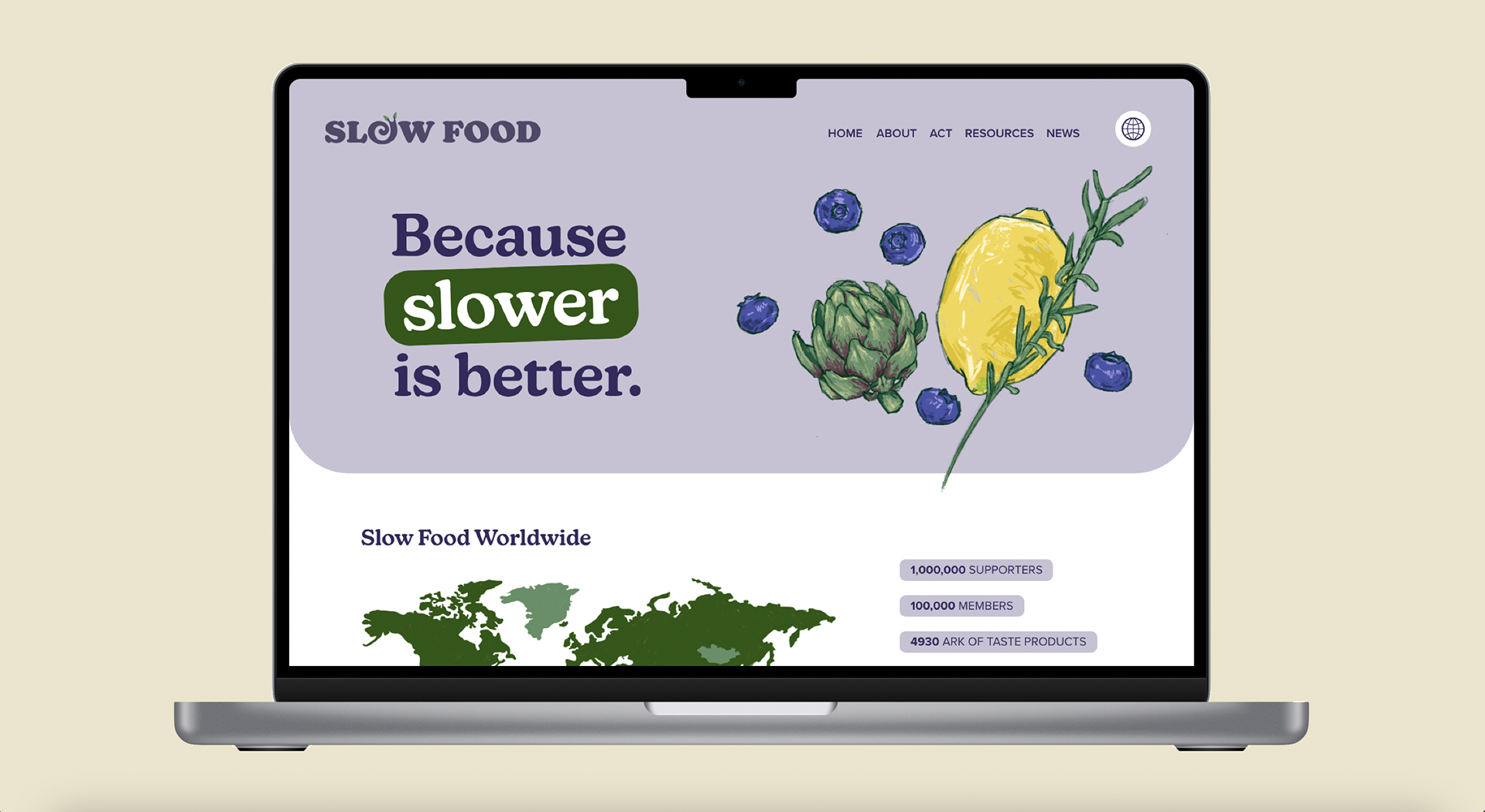
Website Refresh
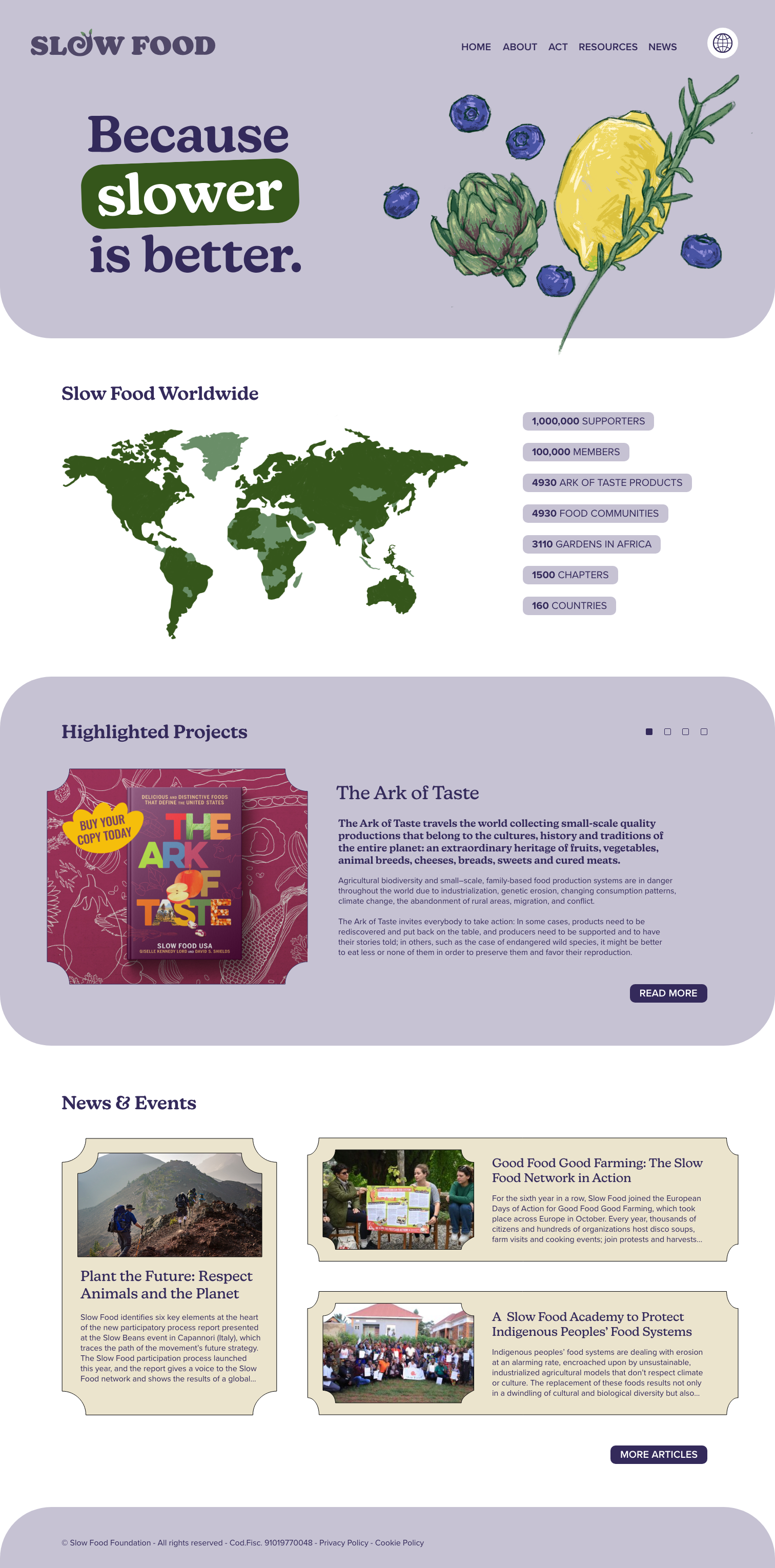
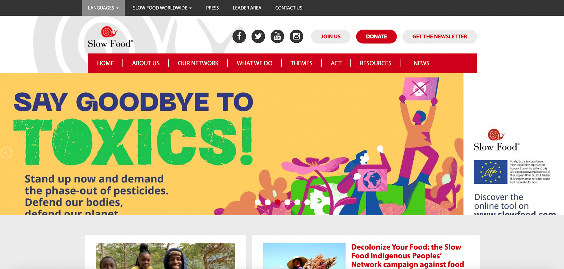
Slow Food website captured 9/4/23
A large factor in choosing to redesign Slow Food's branding was seeing their website (pictured left). There was little consistency across pages and a confusing UI. On the top of the home page alone there were 3 navigation bars. My redesign included site-mapping to create a more usable interface.
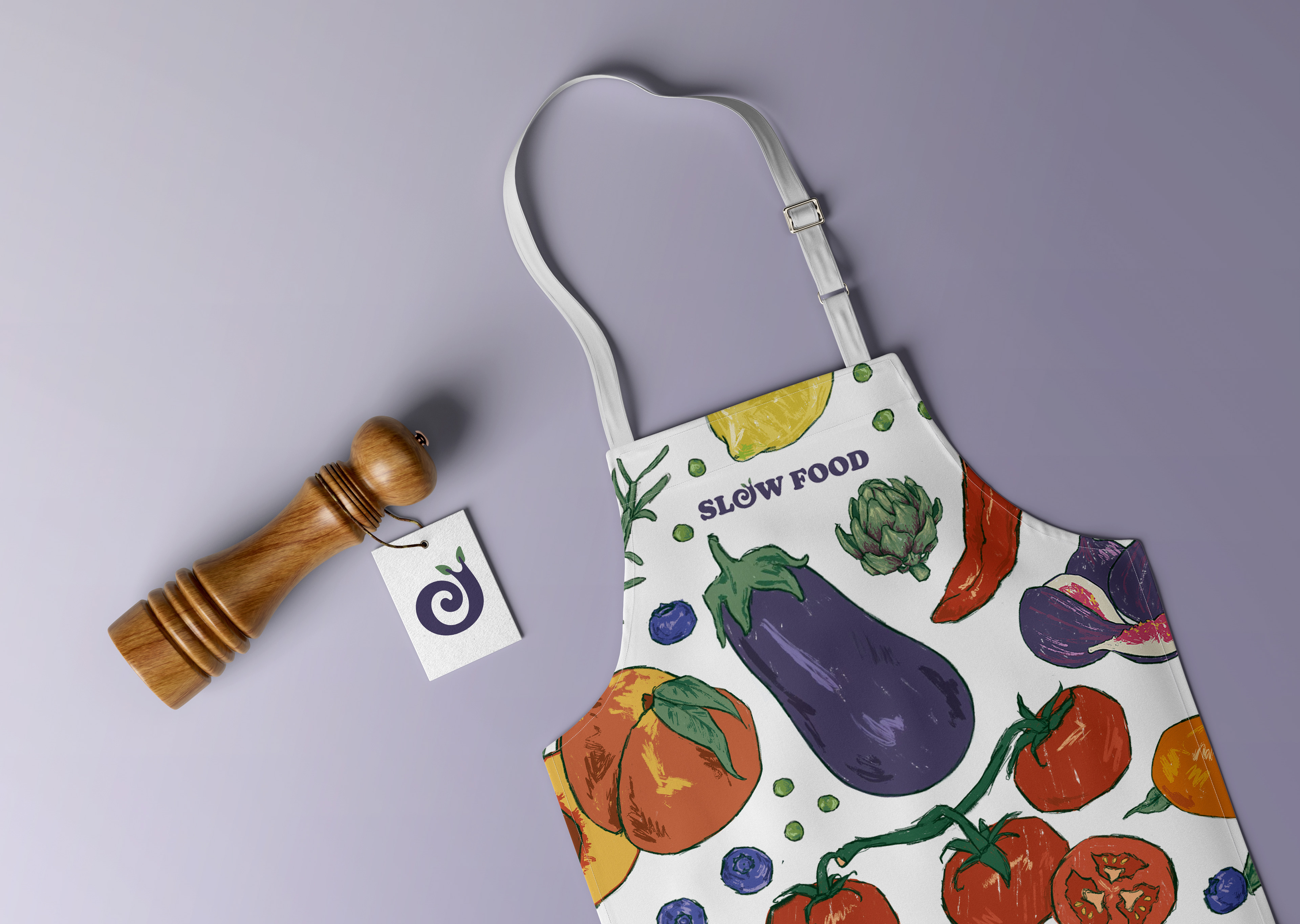
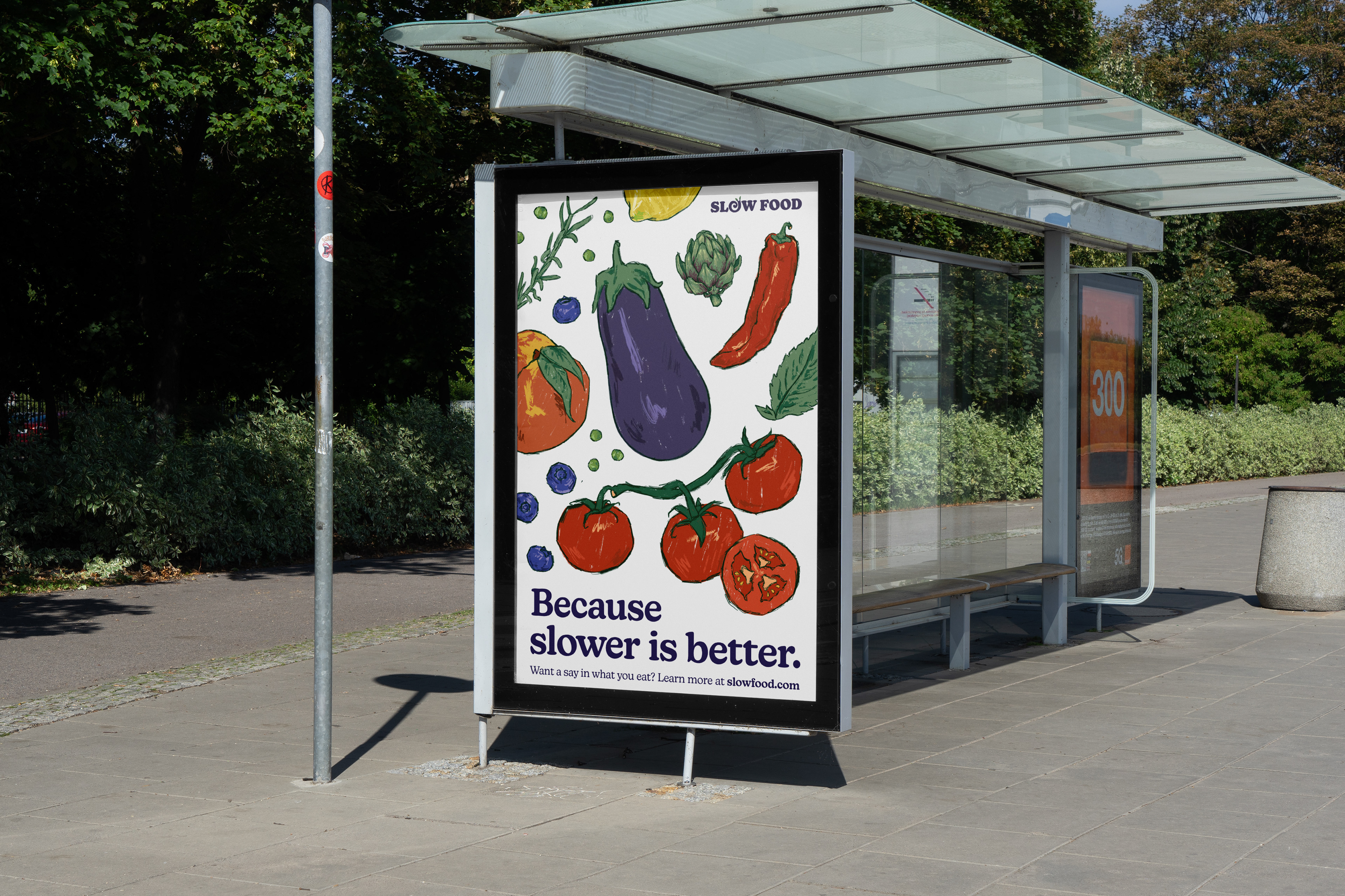
Brand System

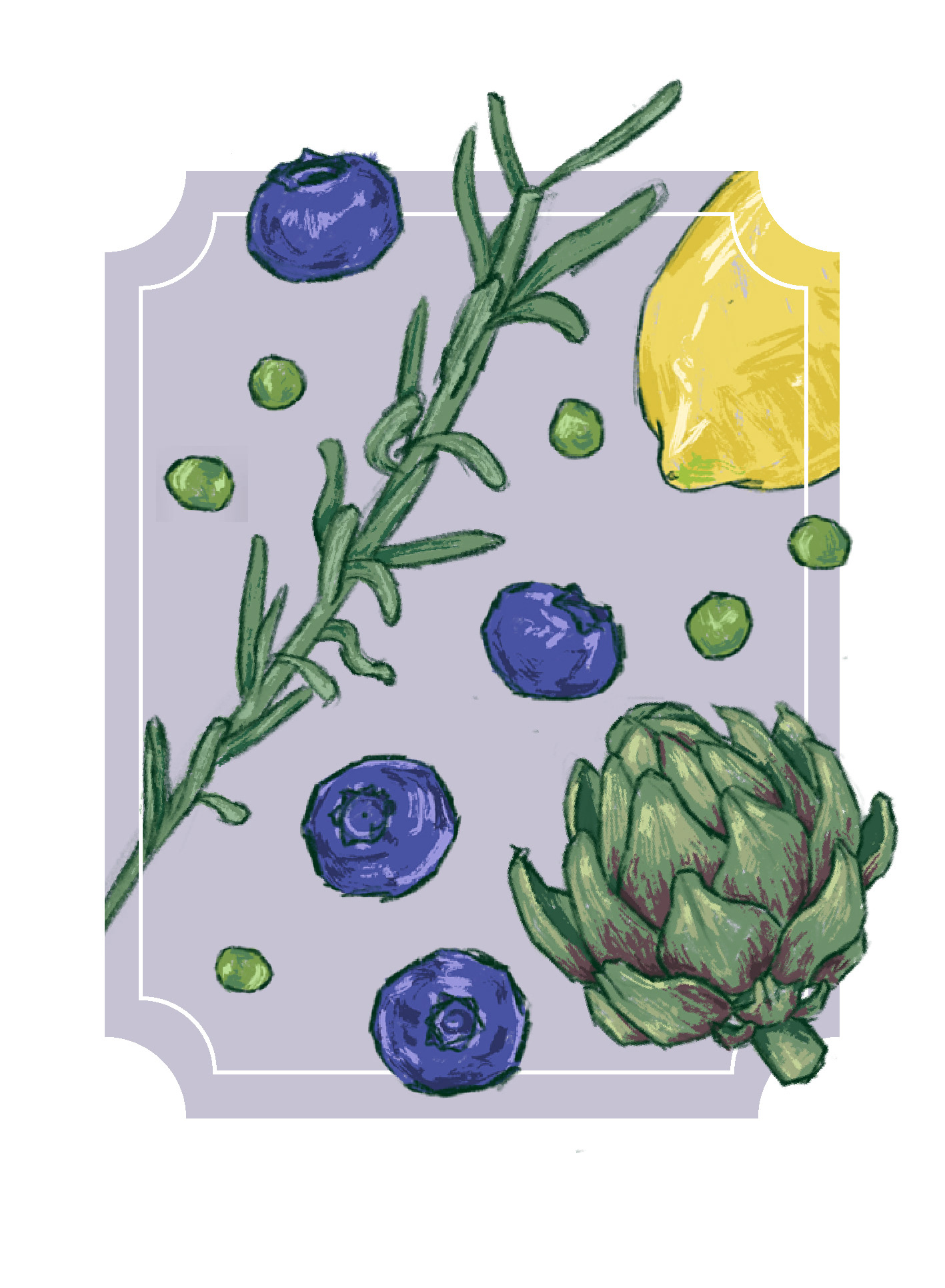
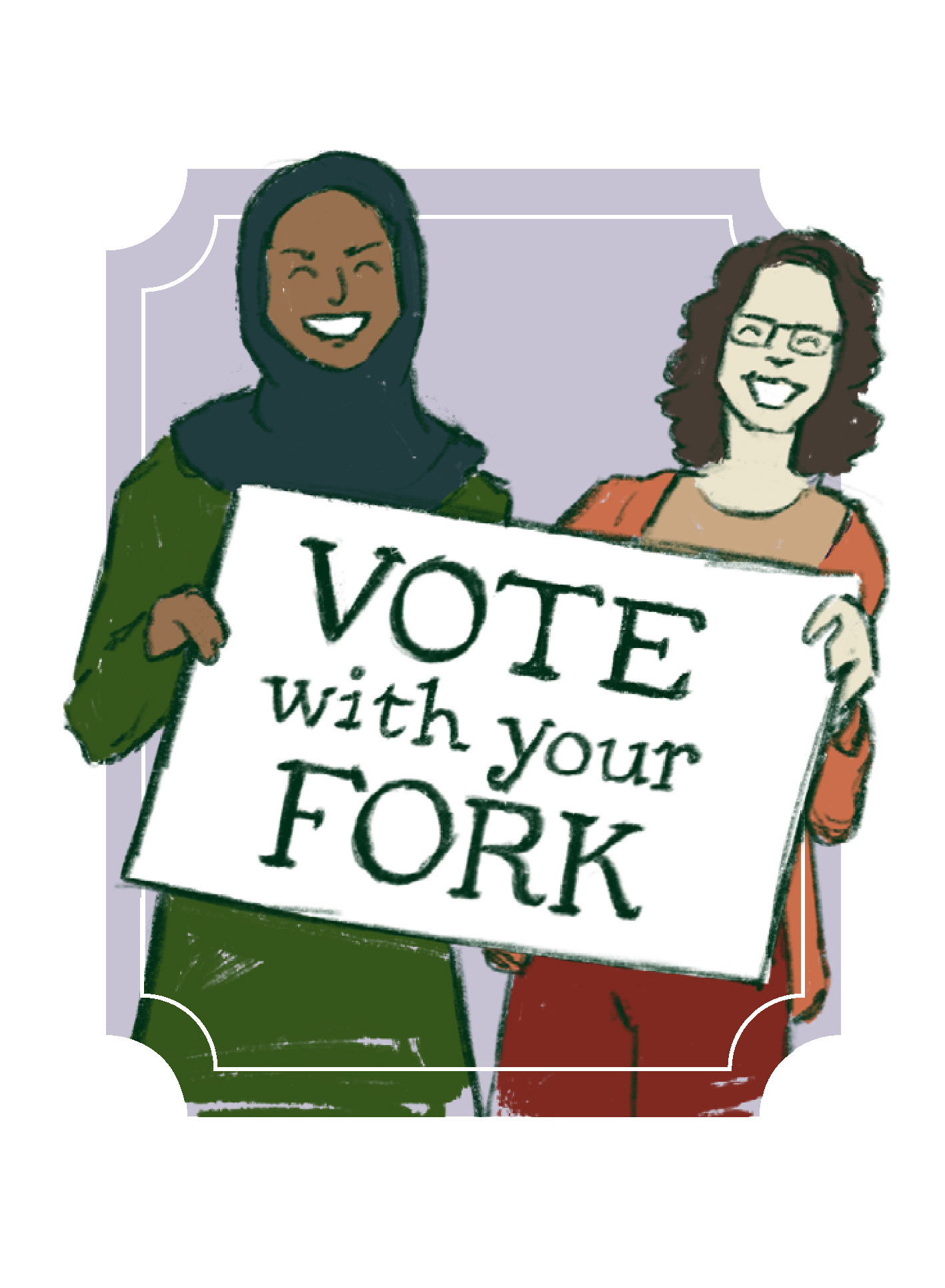
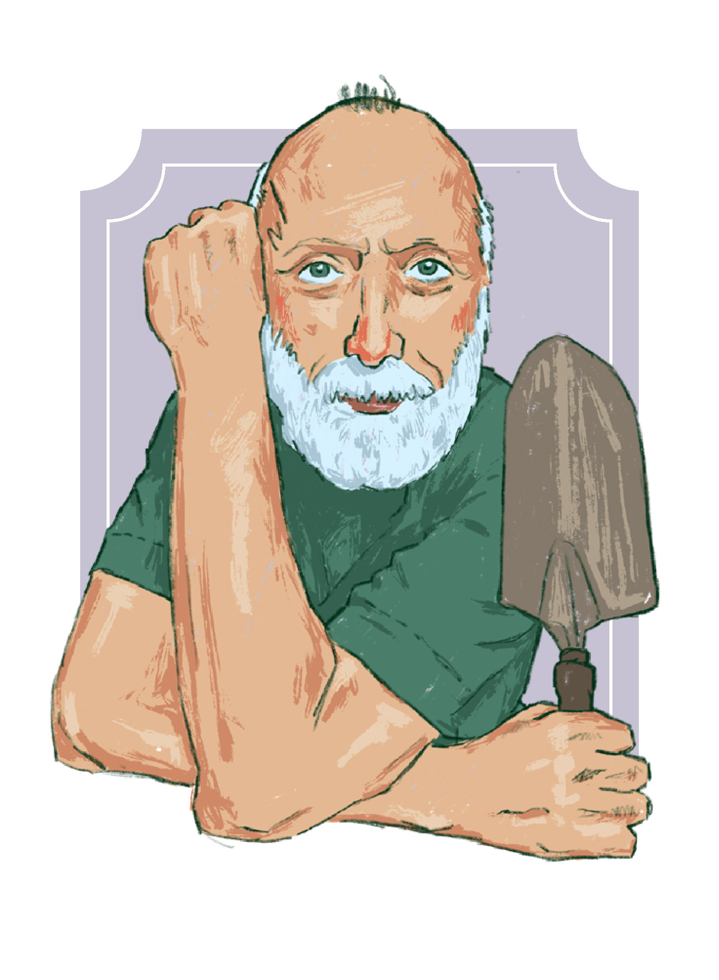
Illustrations

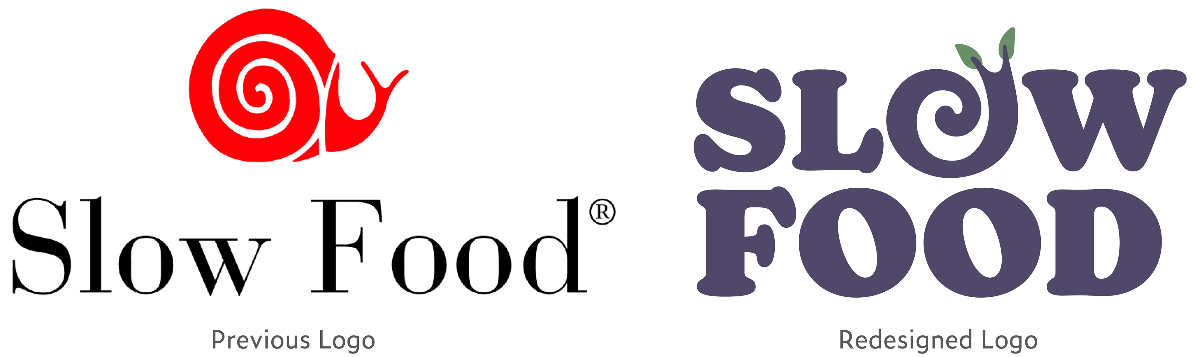
Logo Sketches
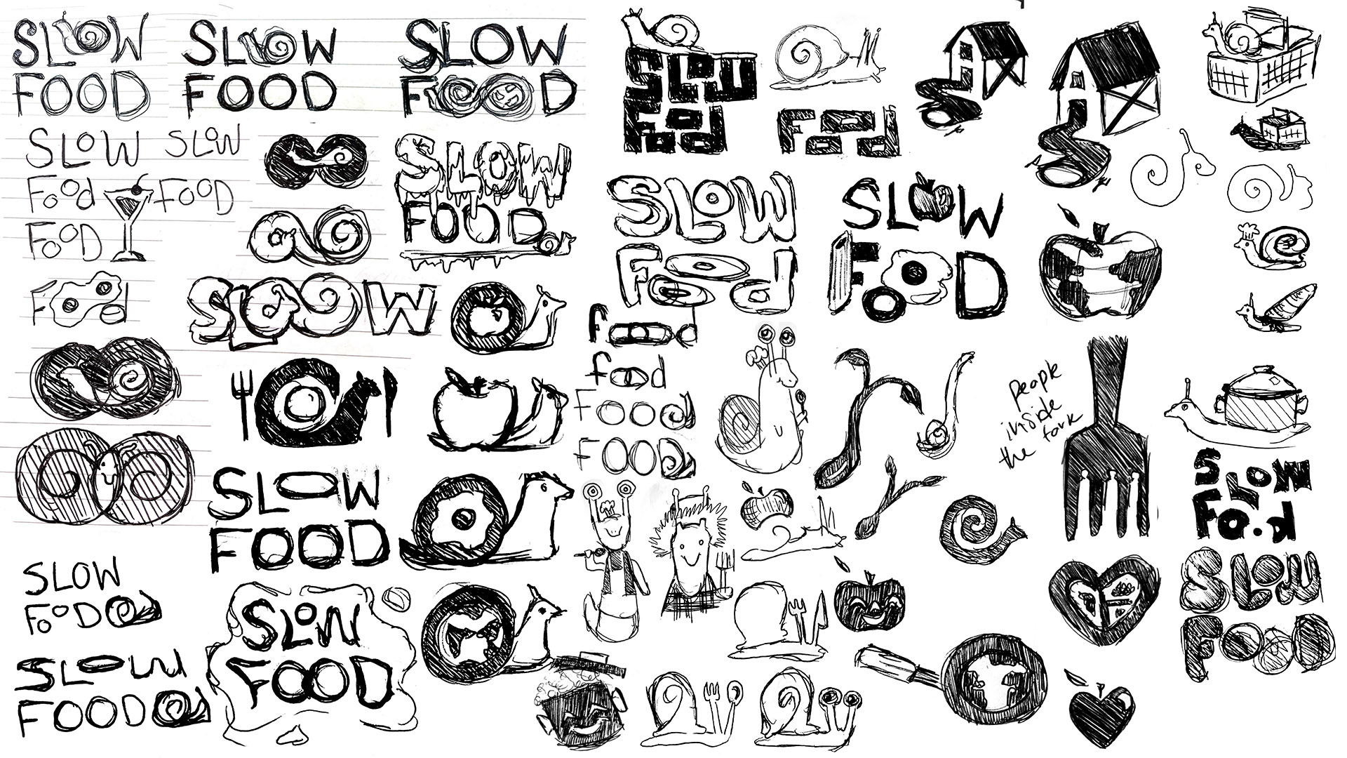
Initial rough sketches
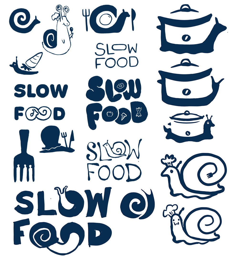
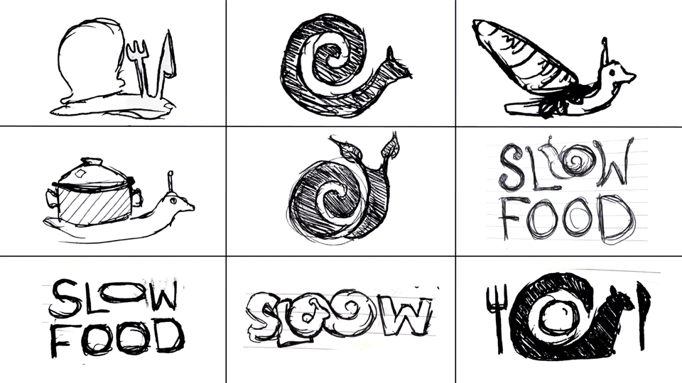
Refined sketches
When it came to the logo refresh, it seemed obvious that the snail that had been
with Slow Food from the start should stay, but I still wanted to explore every option. I played with a variety of typographic marks, culinary symbols, and even chef anthropomorphic snail mascots. Their current mark was fine, but could use more thoughtful and streamlined. Their logotype, however, was poorly kerned and looked to be in a squished, outdated serif. Their ideal solution should harmoniously blend type and mark.
with Slow Food from the start should stay, but I still wanted to explore every option. I played with a variety of typographic marks, culinary symbols, and even chef anthropomorphic snail mascots. Their current mark was fine, but could use more thoughtful and streamlined. Their logotype, however, was poorly kerned and looked to be in a squished, outdated serif. Their ideal solution should harmoniously blend type and mark.
Logo Development
This gif represents many paths I explored as I developed the final Slow food logo, but there were still even more iterations than what's pictured here. What was great about my process was that there was no shortage of good options, just figuring out the strongest option. I tried out various logos, and even variable logo systems before I settled on an option that best represented the winding path food takes as it goes from farm to table. The system allows for a cohesive mark that can break apart or come together for use in every application.
See the Full Brand Guide
Click here to see the full document detailing my Slow Food's redesign.